10 best careers pages and what makes them work
.jpeg)
Making your careers page a true reflection of your brand and values is essential – especially if you’re looking to attract top talent. Almost every potential candidate who comes across your company will navigate to this page to get a feel for what your company represents.
It’s the ideal place to showcase your values, company culture, people and benefits. But above all, it helps communicate your employer brand. You want to give candidates all the content, information, and background they need to understand your company and make an informed decision.
To give you a feel for what a great careers page looks like, we pulled together a list of the top 10 careers pages.
Airbnb's careers page
Careers isn’t just a page on the Airbnb corporate site, it’s a whole microsite with it’s own subdomain: careers.airbnb.com

What stands out:
Airbnb’s careers page ticks all the boxes. Right from the opening headline it pulls you into the Airbnb experience and company culture. They’re clear on the type of people they’re looking for and present Airbnb as a vibrant company that values the adventure and excitement of life.
Bonus: You can see all the openings without clicking away from the page.
Figma's careers page
Figma brings to life a creative culture for creative people.

What stands out:
One of the coolest aspects of Figma’s careers page is testimonials from actual employees. This really brings the experience of working there to life. They also highlight what makes them unique: like an annual employee variety show, Maker Weeks (twice per year), and a bi-monthly show-and-tell for people to celebrate the work they’re proud of. Figma features lots of photography of real employees engaging with each other.
Medallia and Medallia People
Medallia brings inclusion to life on their careers site and people page.

What stands out:
Medallia puts diversity front and center at the top of the page with a featured video showing people engaged in a range of activities beyond work. They make finding job postings easy with a search box at the top and use inclusive, value-based language throughout.
Bonus: A separate page dedicated to their people highlights individuals from their dynamic, diverse team with video interviews that showcase each employee’s unique personality and values.
Stripe's jobs page
Stripe’s mission-driven culture makes their jobs page stand out.

What stands out:
Stripe makes their mission to empower innovative and ambitious organizations the main focus of their careers page. They put a professional founder’s story video at the top of the page – and it’s inspiring. Scrolling down the page reveals an in-depth overview of their business model, expressed with humility about challenges they’ve faced, and the experience of working at Stripe.
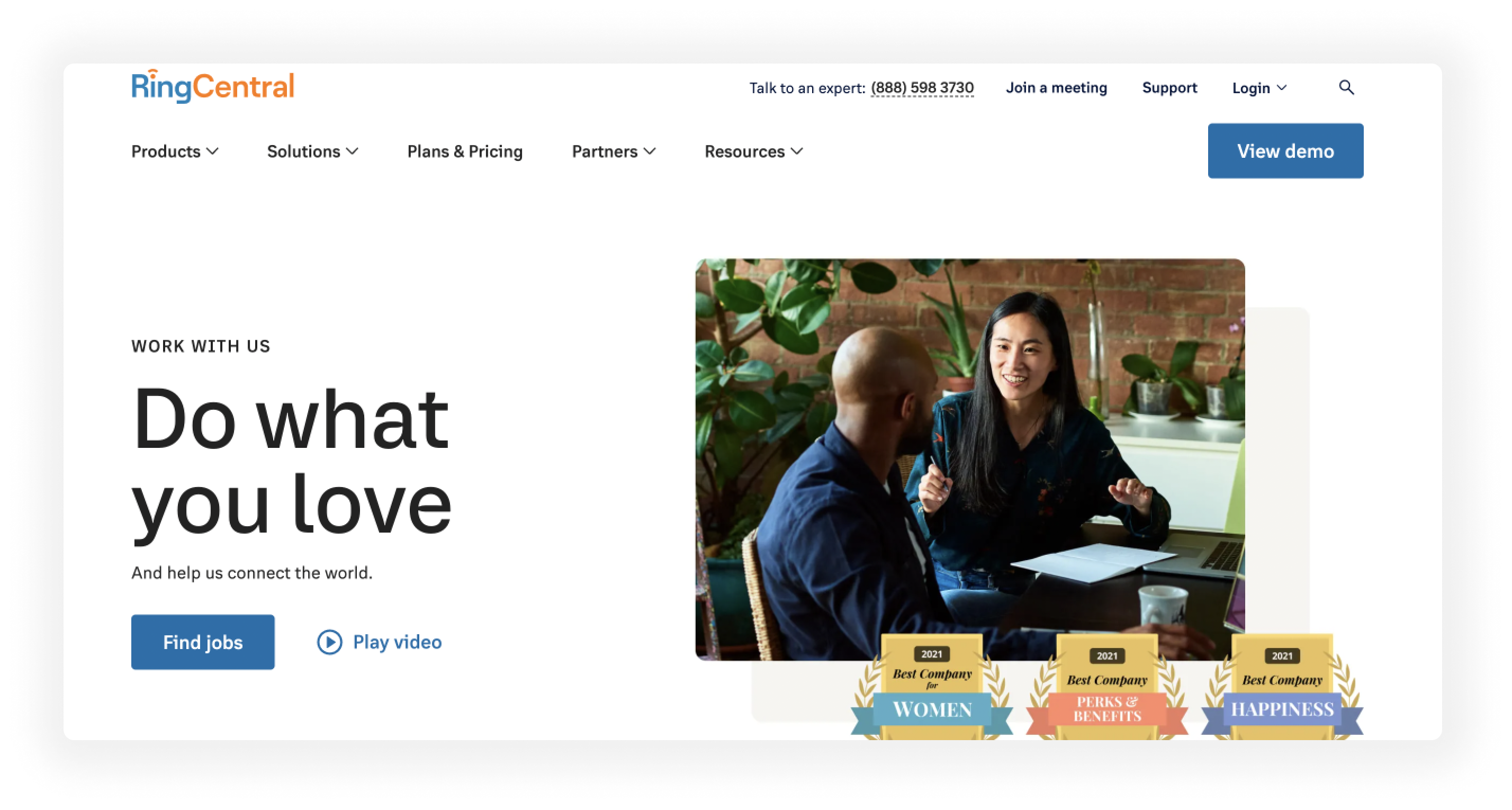
RingCentral's careers page
RingCentral offers an aspirational approach to careers.

What stands out:
RingCentral’s page is centered around offering dream jobs that allow people to thrive and grow into who they are. The strong call-to-action at the top of the page beckons candidates with “Let’s find a dream job…” in the search bar. Following a diverse testimonials section that invites candidates to be themselves, RingCentral provides another strong call-to-action highlighting dream job openings around the world.
The page closes strong with an overview of employee benefits, brief introduction to each department, and a video that highlights their world-class candidate experience.
Gong's careers page
Gong makes the job search fun with a strong lean into diversity.

What stands out:
Gong’s careers page feels like you’re joining a unique club of Gongsters. It highlights the company’s character right from the jump with the invitation to “Become a Gongster”. Following a list of open positions, the page features employee video testimonials plus “8 Reasons People Hate Working at Gong.” They back up the humor with stellar reviews, a clear statement about belonging, plus generous benefits, and their commitment to giving back.
Bonus: Belong at Gong goes beyond a diversity statement to show how belonging happens at the company.
Pinterest's careers site
Pinterest brings the creative career to life.

What stands out:
Pinterest’s page has a stunning visual design that’s bound to attract creatives of all walks of life. It’s a beautiful page that uses a unique interactive approach to access opportunities, similar to how the product works. Images of real employees model their mission statement: to inspire people to create a life they love and empower their people to thrive. You can even sign up for job alerts.
Bonus: Pinterest careers has its own domain: https://pinterestcareers.com
Uber's careers page
Uber seeks innovators to continue to reimagine the world.

What stands out:
Uber has a more typical careers page, but it hits the mark with a clean design and clear mission-driven messaging. The page brings candidates inside the experience of working at Uber with an intro video that features a very inclusive cast of employees, highlights the innovation the company is working on, and invites people to come reimagine the way we move and live – an exciting proposition.
Intuit careers
Intuit’s careers page is easy to use and simple to navigate like their products.

What stands out:
A clear headline and strong call to action right in the main header invite candidates to browse for opportunities. The rest of the page focuses on their breakthrough technology while highlighting employee stories from the company. They also showcase their awards and employee reviews to highlight a “world class culture”. An alert banner links to the company’s “return-to-work” plan.
Careers at Apple
Apple puts diversity and inclusion first with a transforming logo to welcome all.

What stands out:
Apple branding stands out on their careers page with an eye-catching logo and video to show Apple as a place for all. The video speaks directly to the viewer and highlights what type of person would thrive at Apple. The page also includes employee testimonials, open positions, core values, and ways people can make a difference. They went with a sleek and minimalist design with active images, but included a ton of content to click through and explore.
Bonus: The values section really stands out, highlighting their commitment to accessibility, education, environment, privacy, racial equity and justice, to name a few.
Employer branding and your careers page
To sum up our findings, the best careers pages tell your brand story and evoke your values. This is the best way to attract candidates who will be able to make a meaningful contribution to your company’s goals and purpose. Branding is not just a great way to hire people, it is core to creating a culture of diversity, equity, inclusion and belonging.
The companies highlighted here have gone beyond the diversity paragraph on their pages to using language, imagery, and highlights to communicate how diversity is part of their workplace.
What should you look for in your own careers page?
- Create an eye-catching design that’s right on-brand
- Use real people and activities to highlight values and culture
- Describe the attributes of employees you’re looking for
- Inspire candidates with your mission and vision
- Make it easy to explore open positions and apply for them
Once you’ve optimized your careers page, be sure to promote it across all your social media channels. As your company evolves, be sure to keep your careers page up to date.
Updating your careers page is a fantastic way to attract top talent to your company. It’s a crucial sales pitch for your brand and can make all the difference anytime an interested candidate visits your website.
.svg)


